
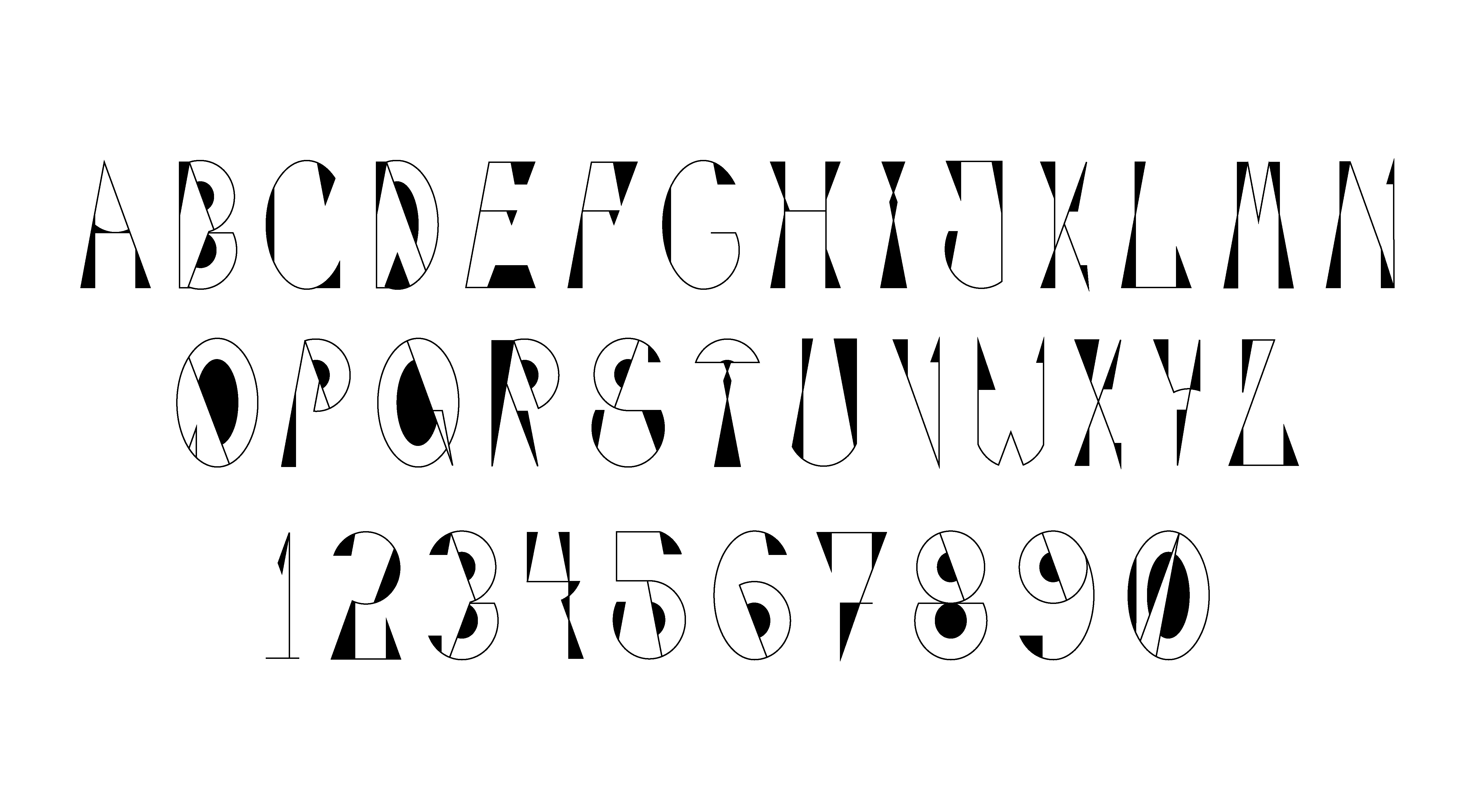
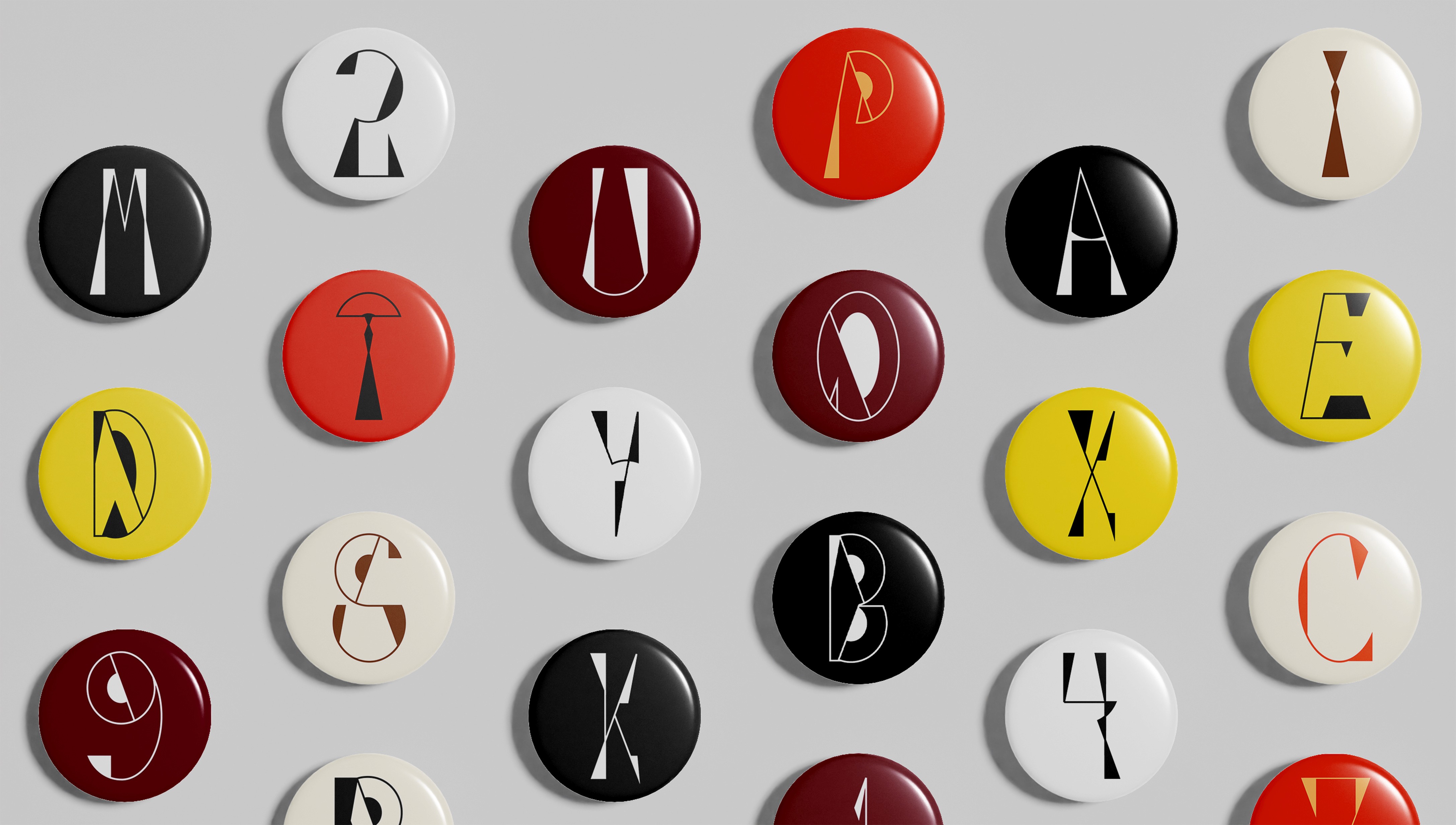
Font
The display typeface draws from the layered architecture and vertical density of Mumbai. Inspired by the balance and motion found in Calder’s mobiles, the letterforms combine geometric shapes and shifting visual weight to create a sense of rhythm and movement.
Each character balances structure and playfulness, reflecting both the dynamic cityscape of Mumbai and the sculptural qualities of Calder’s work.
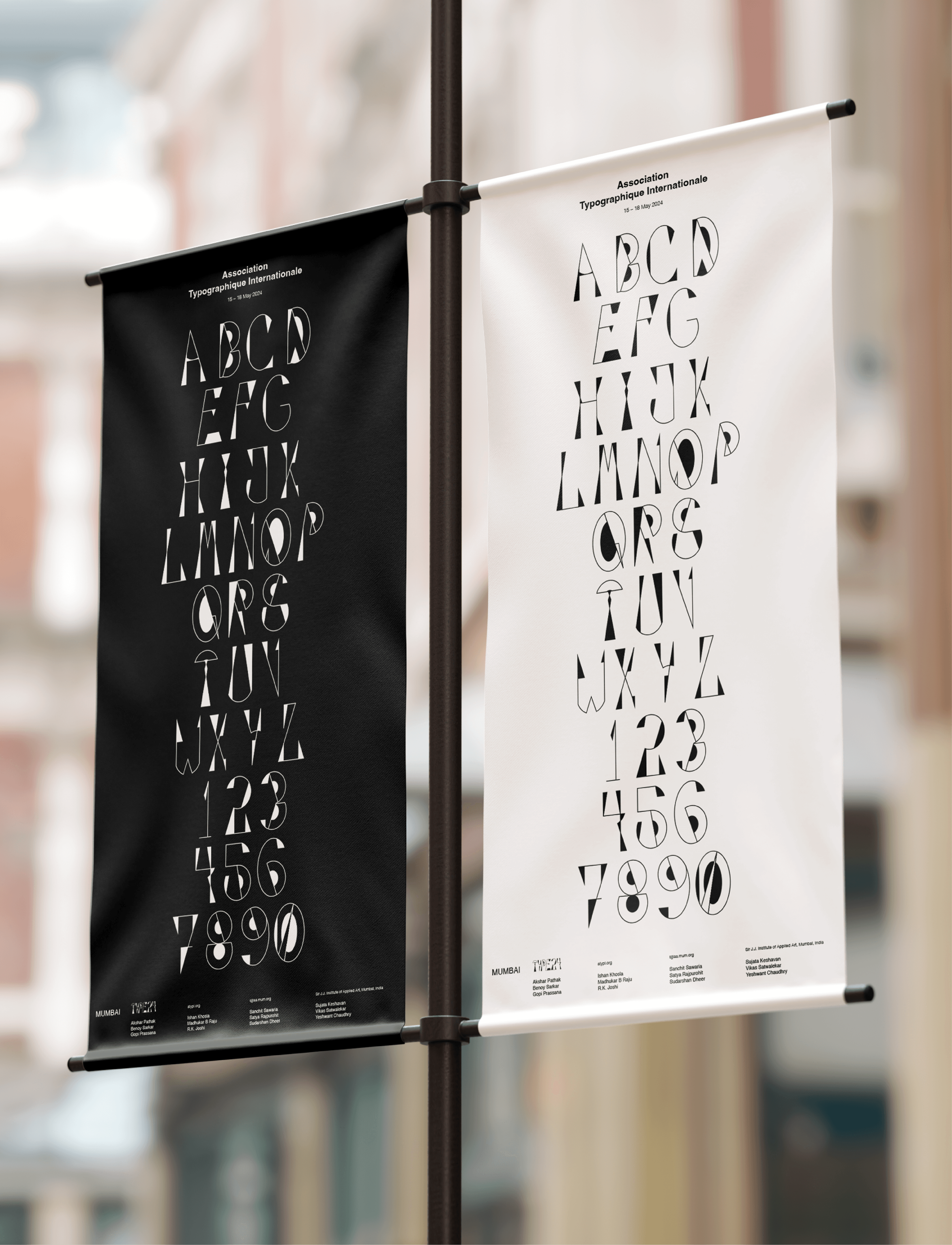
Posters
The poster series introduces each participating artist. While the typographic structure remains consistent, the generative background adapts to reflect the visual language of each artist’s work, allowing the identity to shift while remaining part of the same system.

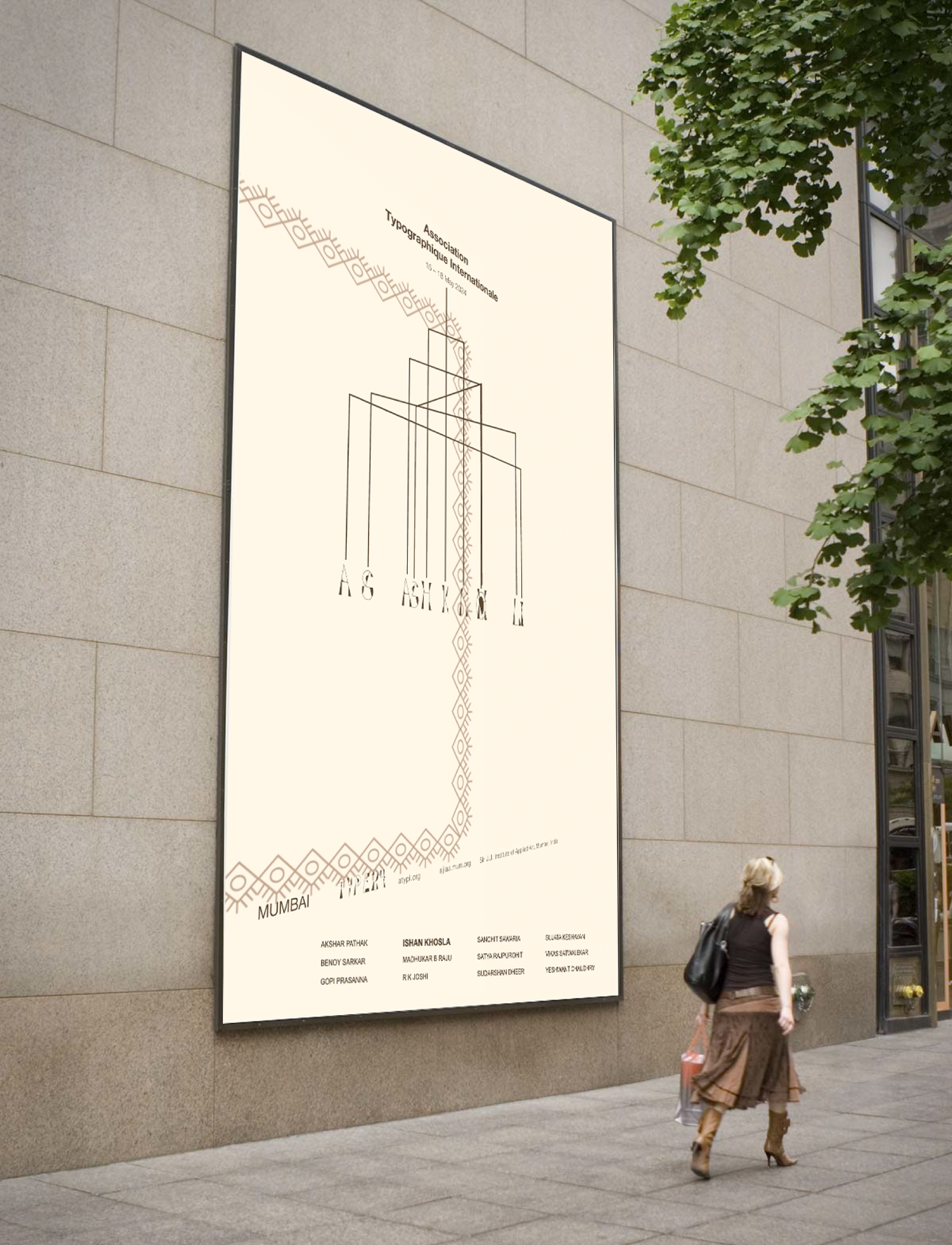

Generative Design & Installation
The identity expands into an interactive installation inspired by Calder’s hanging mobiles. Visitors can select an artist and interact with the structure, rotating and viewing the mobile from different perspectives.
This interaction allows the system to continuously shift and rebalance, echoing both the physical movement of Calder’s sculptures and the evolving nature of typographic expression.
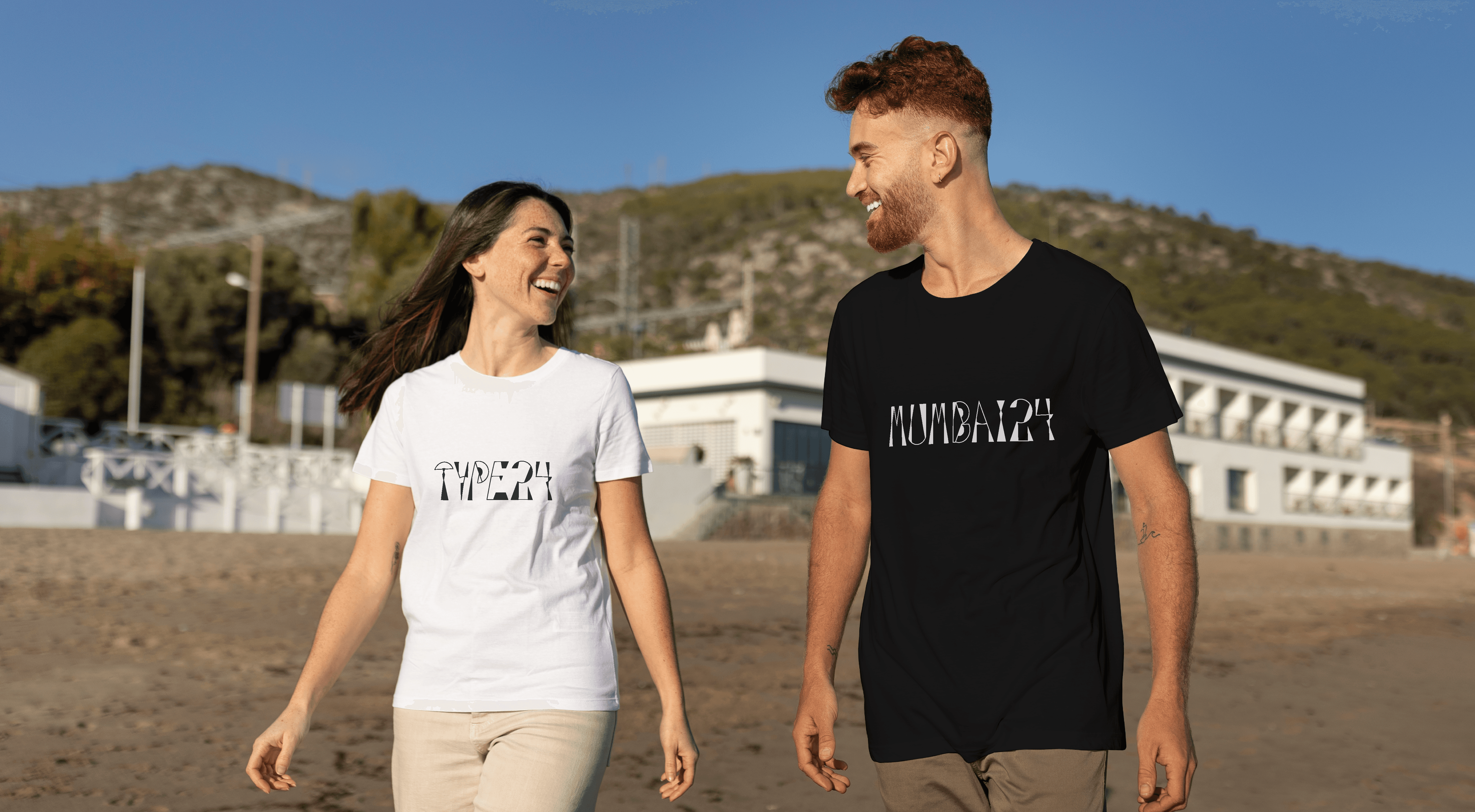
Identity

2026© Jainisha Vira